Tinkon | 品牌包装视觉设计
Tinton 是一个做膳食补充保健品的品牌,我主要负责两款产品的包装设计。
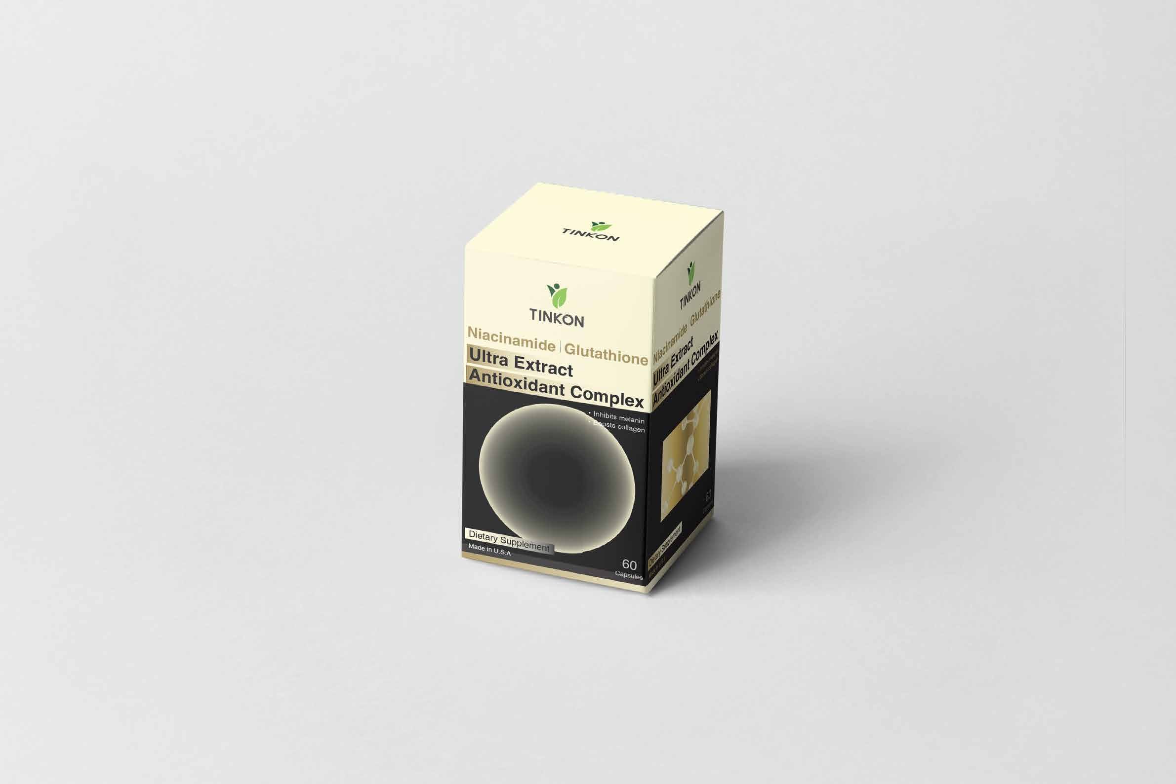
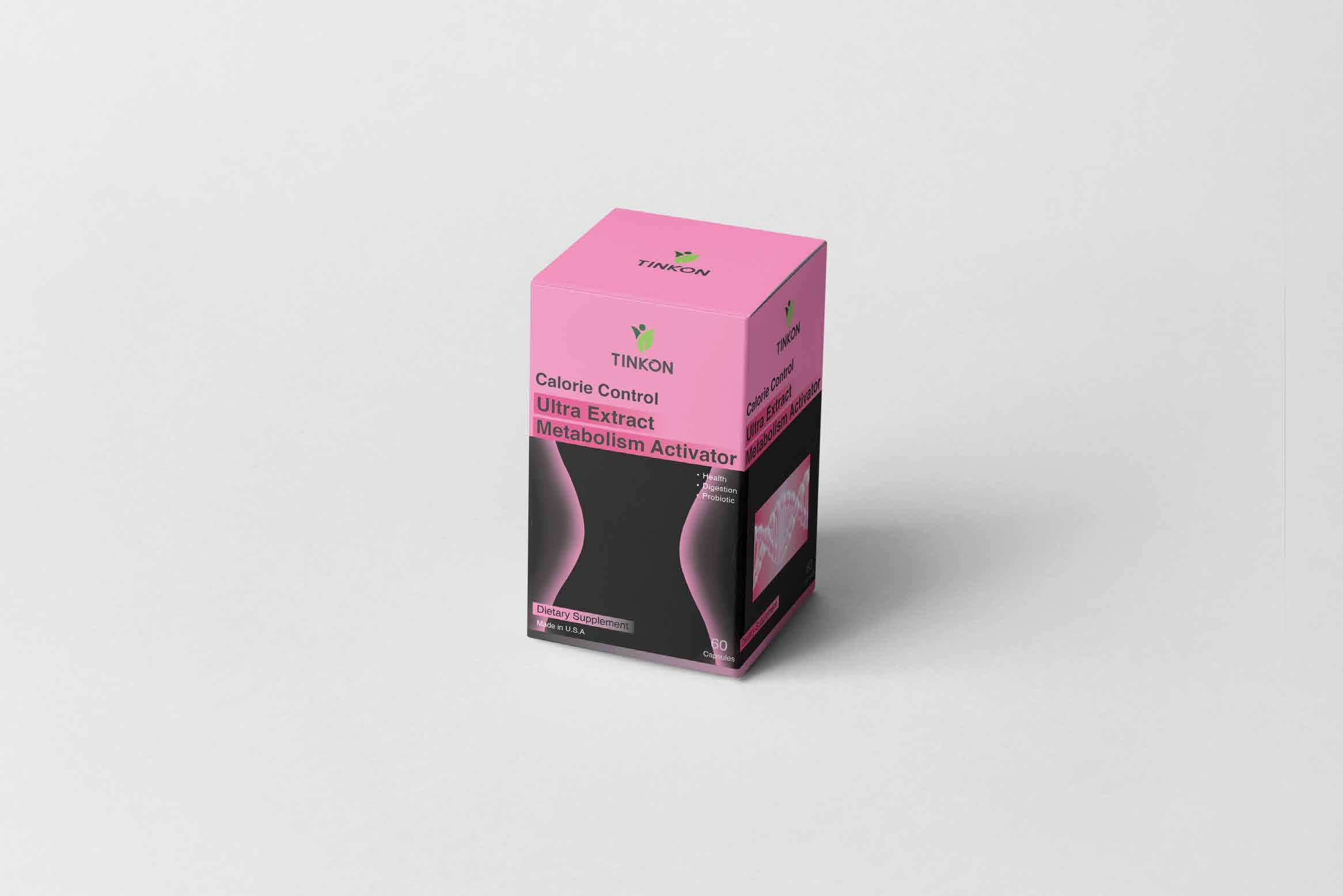
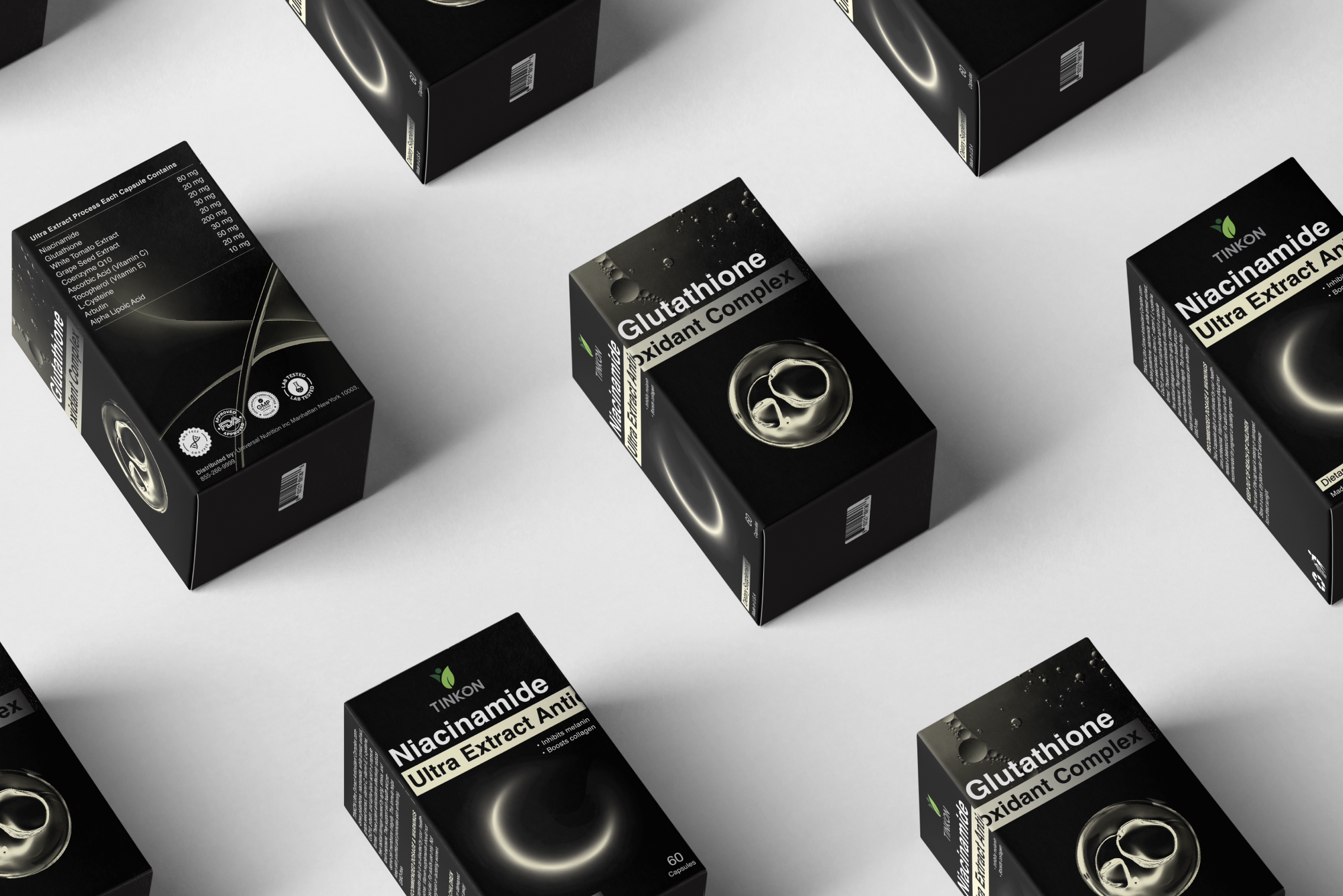
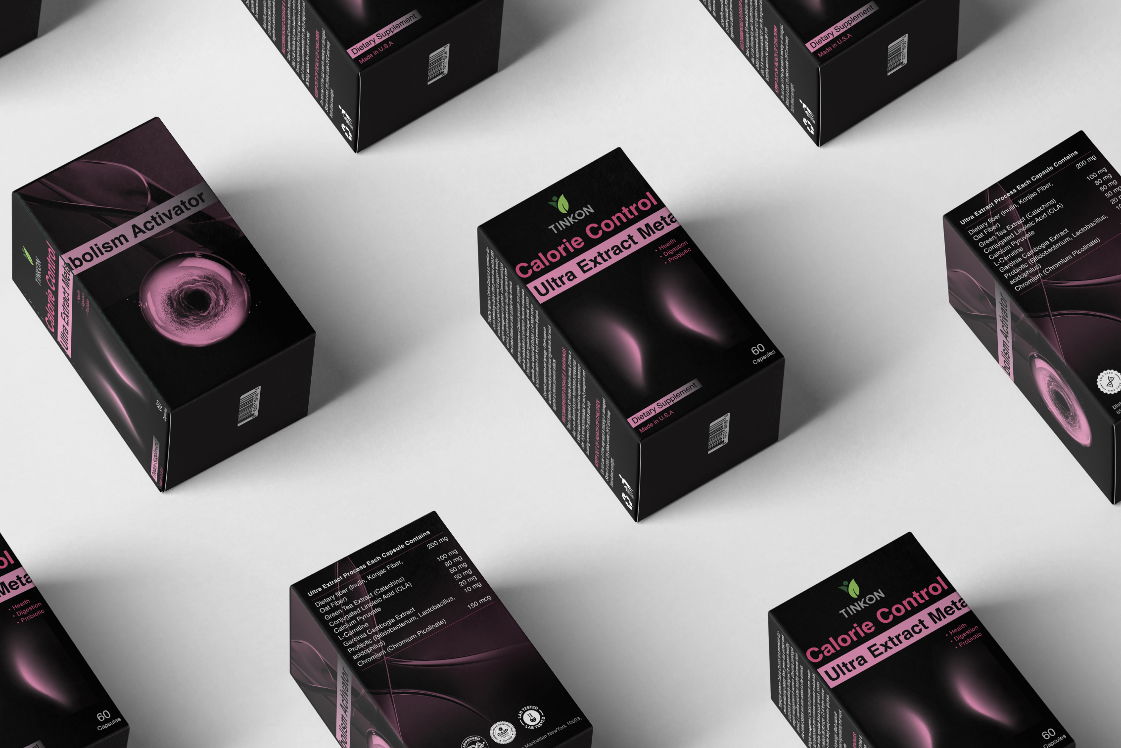
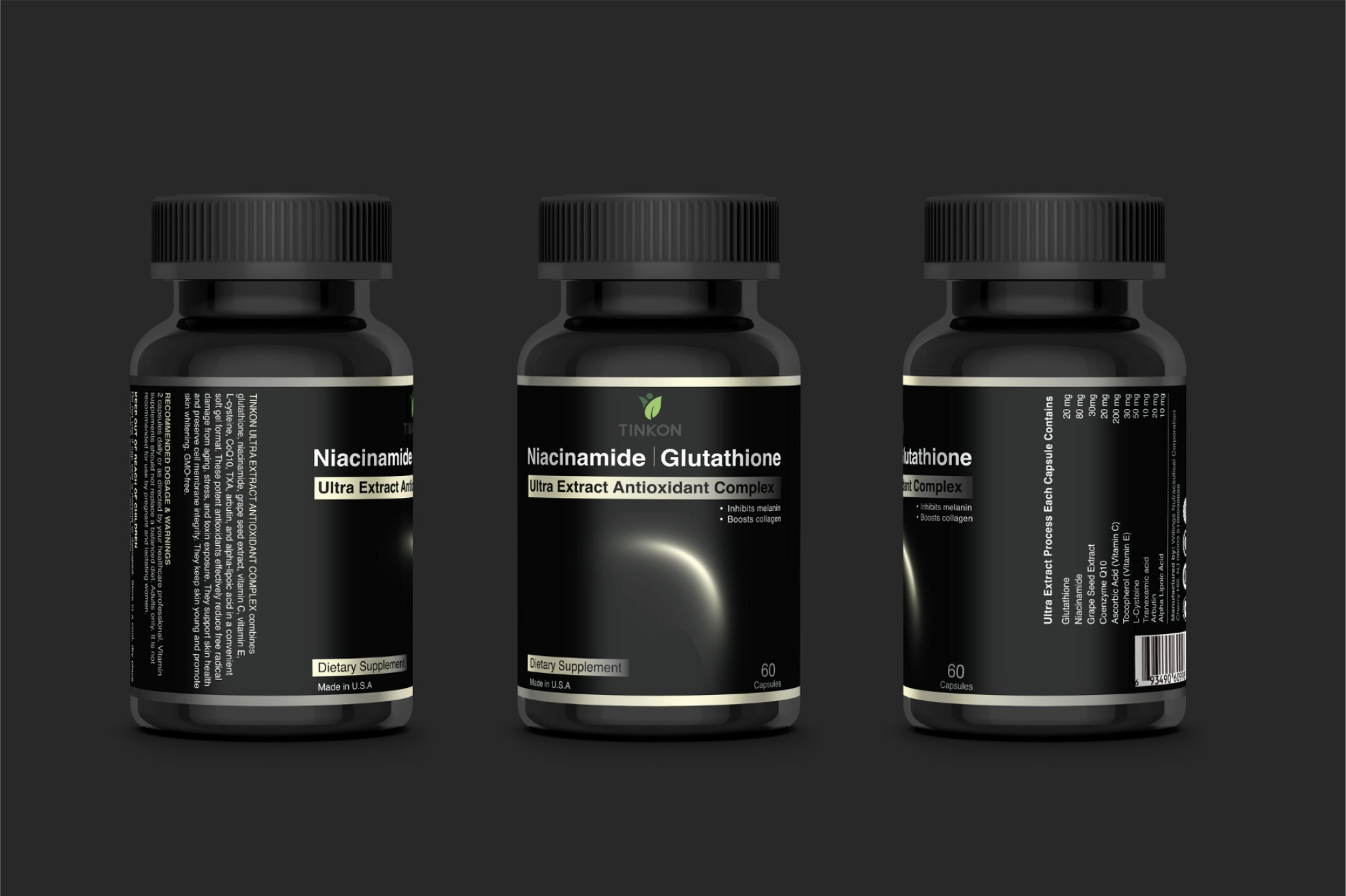
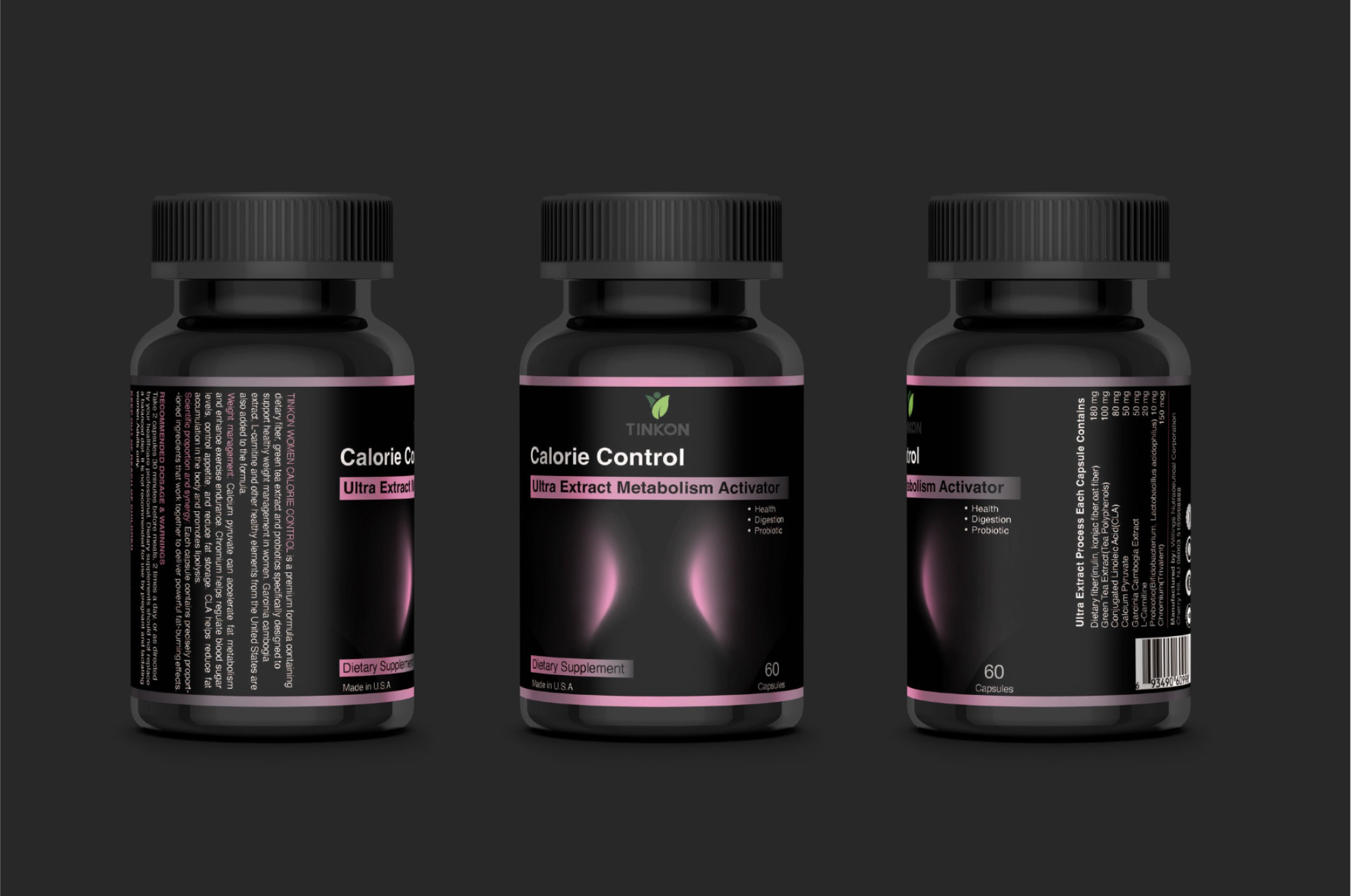
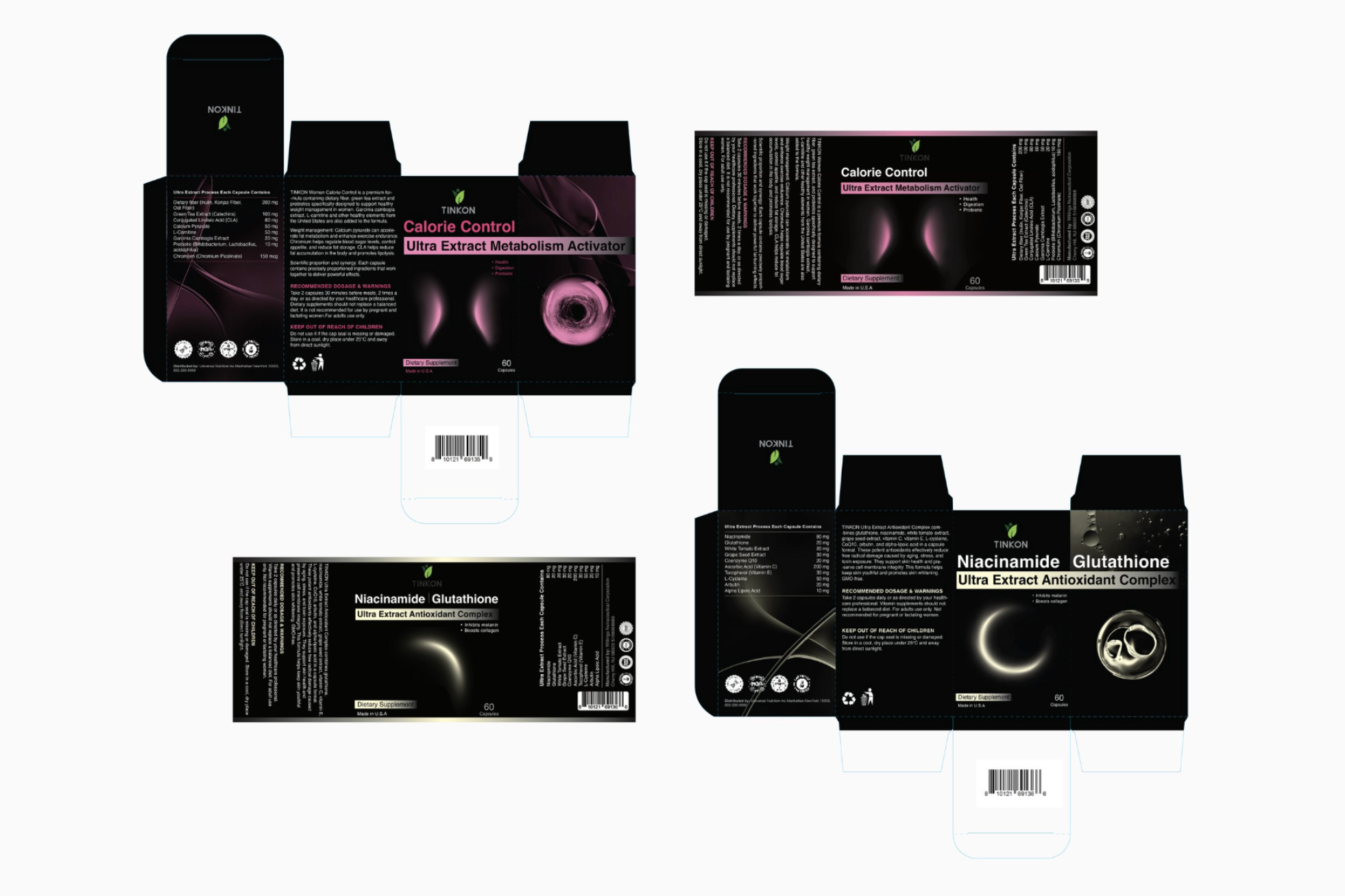
因为产品的名字都是英文药学名词,中国消费者理解起来比较困难,所以我选择用更直观的视觉图形来突出功能,弱化文字表达,让大家能一眼看懂产品的作用。
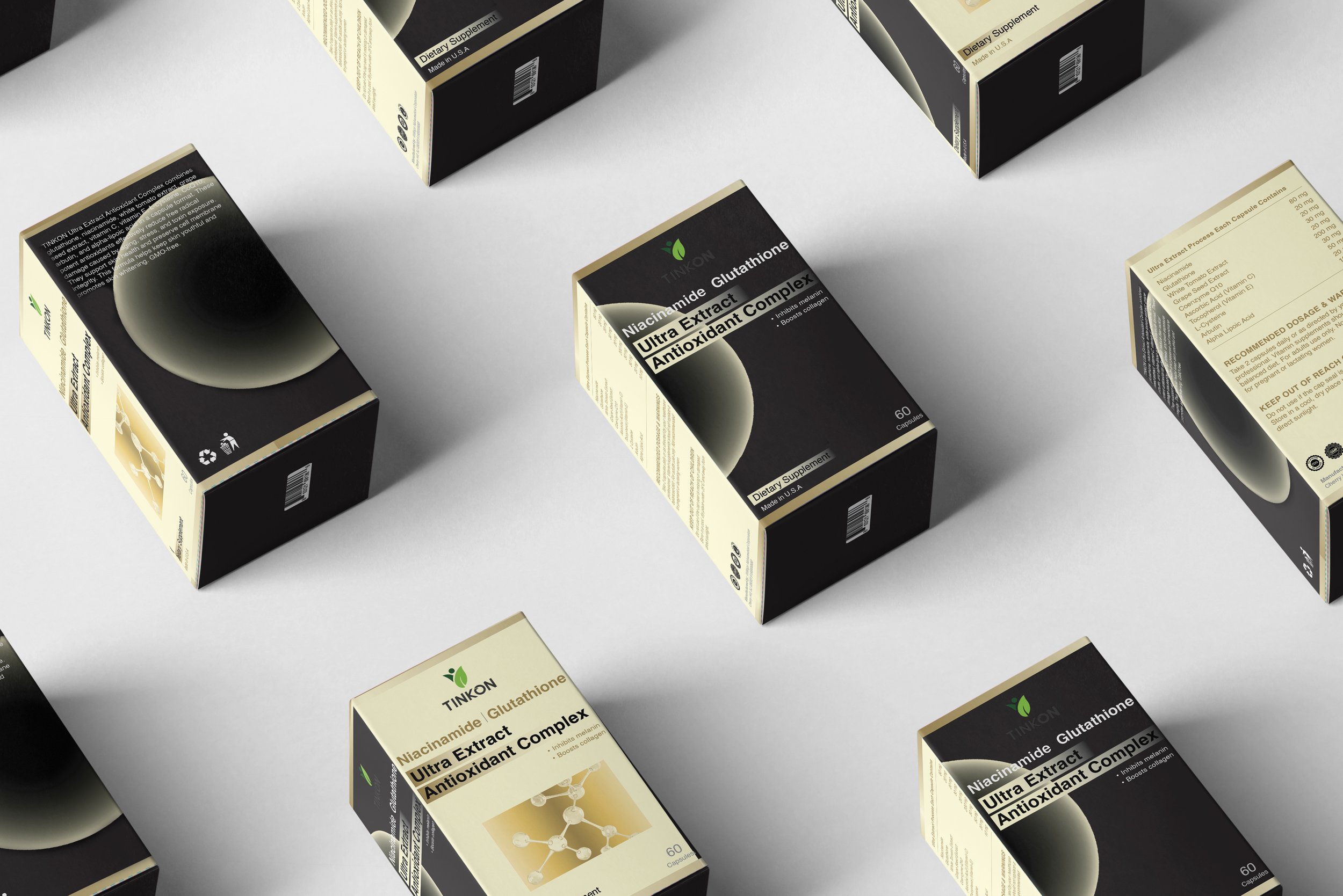
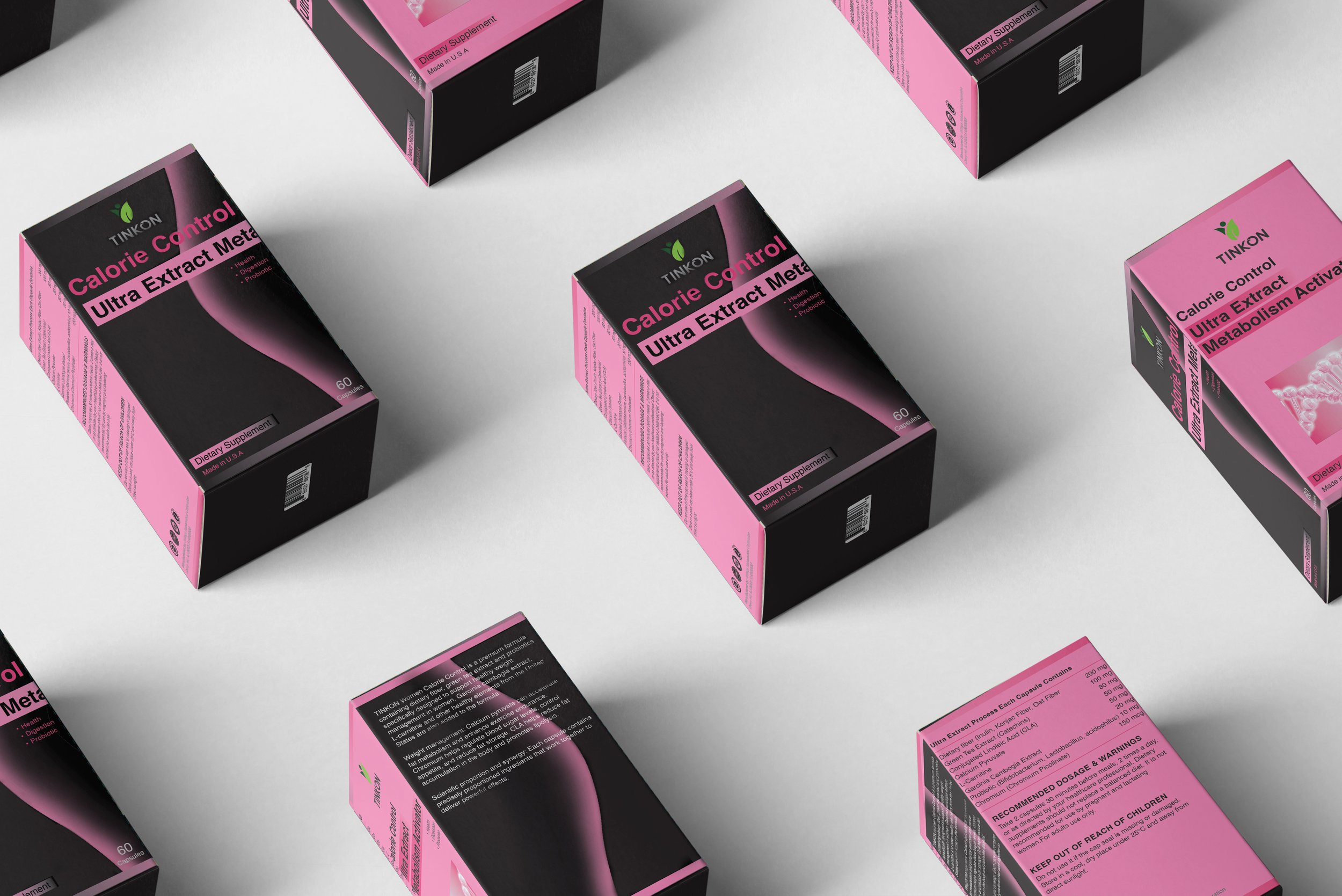
考虑到黑色瓶身的基础,我设计了多套方案,结合了不同的字体、颜色和排版,比如用围绕瓶身一圈的uv色环提高产品在货架上的辨识度,淡黄色系表现烟酰胺产品的抗氧化通透皮肤等功能。这是一次愉快的合作体验。
2024
Tinton is a dietary supplement brand, and I designed the packaging for two of their products.
Since their names are technical English medical terms that may confuse Chinese consumers, I focused on using clear, intuitive visuals to highlight each product’s functions rather than relying on words.
I explored various color palettes and layouts, including a bright UV band that wraps around the bottle for increased visibility and a soft yellow tone to represent the brightening and antioxidant effects of the niacinamide product. It was a smooth and enjoyable collaboration with my clients.
未采用方案 ▫️Unadopted Proposal